CLIENT
Team Machine
BRAND
Team Machine
EMPHASIS
Team Machine strives for clear and concise design and direction. They contrast whitespace with color to create balance and mitigate ambiguous perceptions.
MOTIF
Team Machine branding is for the motivated; the small percentage who seek to create authenticity. our branding assets are imperative to our success; they are our primary voice.
ELEMENTS
black and white + high contrast + balance + clean design + whitespace + red accents

DELIVERABLES
logo marks + brand guidelines + website
LOGO MARKS
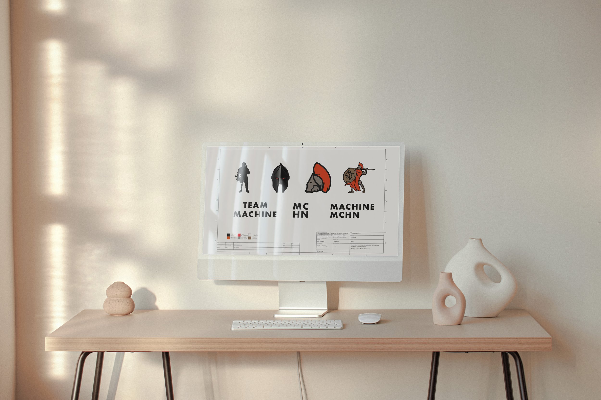
For Team Machine, I built over 40+ logo marks and branding assets. All of them are based off what you see below, helping to encompass a complete brand package for all circumstances. When I build a brand and create logos and submarks, I also create instructions and uses cases for each logo, so the client has a clear understanding of where and when to use their logos and submarks.
USE CASES FROM LEFT TO RIGHT
-
The Silhouette logo is the primary mark for Team Machine. This logo is used in almost all situations unless chosen otherwise.
-
This logo was created for the LLC; the company that owns Team Machine. The Helm represents vigilance.
-
I put this submark in here to show the diversity in one logo. The use case is for small, less detailed circumstances when the full Spartan logo would be too complex.
-
This is reserved for special occasions. The battle dress and mohawk represent action, leadership, and stability. It is the Helm logo in battle; full plumage, leading from the front.

BRANDING
(rotate for full screen)

WEBSITE
(rotate for full screen)


