CLIENT
Precision Components
BRAND
The Forge
EMPHASIS
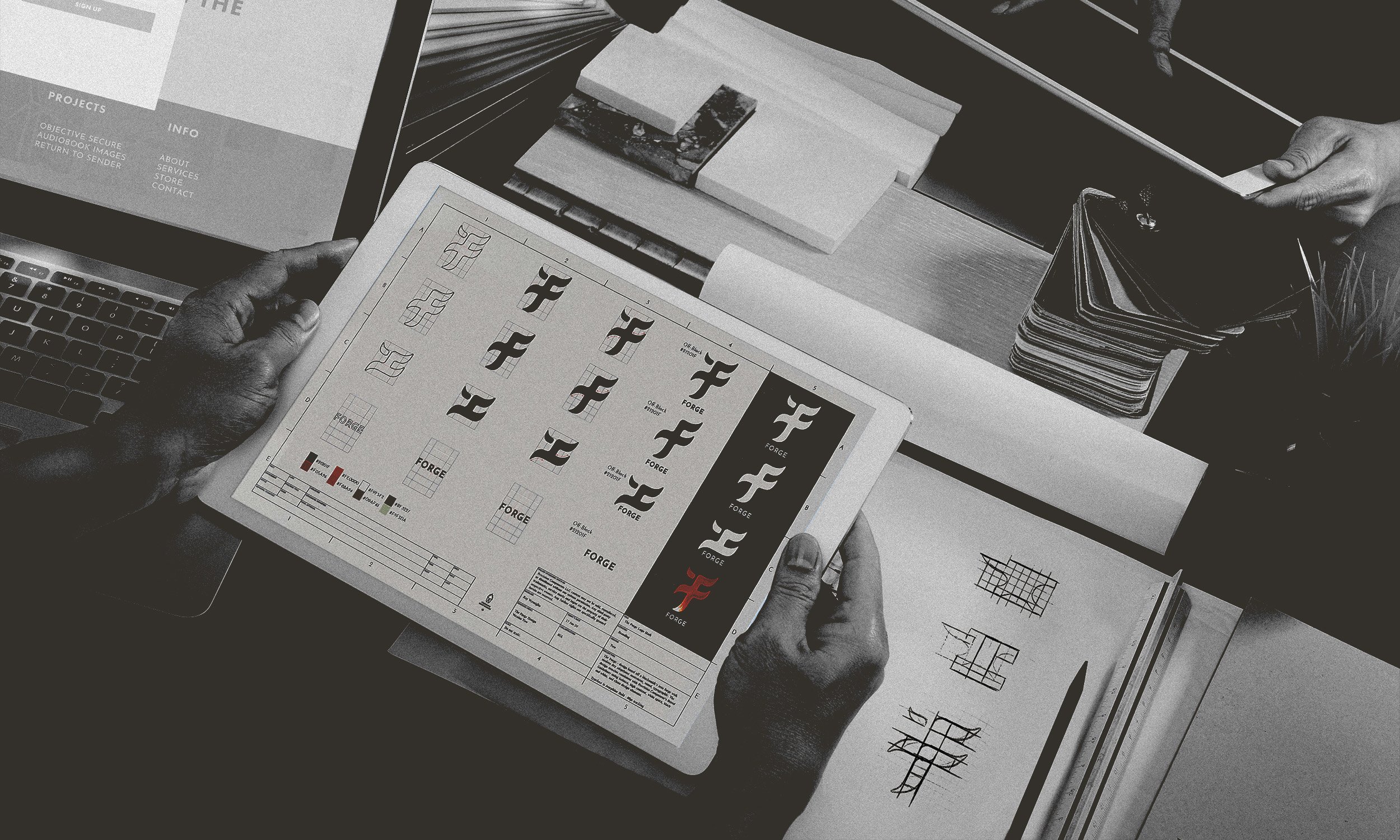
Designed with an emphasis on movement,
I took inspiration from the shape of a blacksmith's anvil, while including path, focus, and balance.
THE TRIBE
This was my first brand and design assignment for a subscription-based website; a company whose soul purpose was to provide an engaging community for goal-oriented people. When I began sketching, I wanted to make my lines swoosh with movement and flow but also keep an outside idea of symmetry.
SYMBOLISM
Path + focus + balance + community

DELIVERABLES
Branding + logo marks + website
BRANDING
Movement + Action + Achievement
LOGO MARKS
-
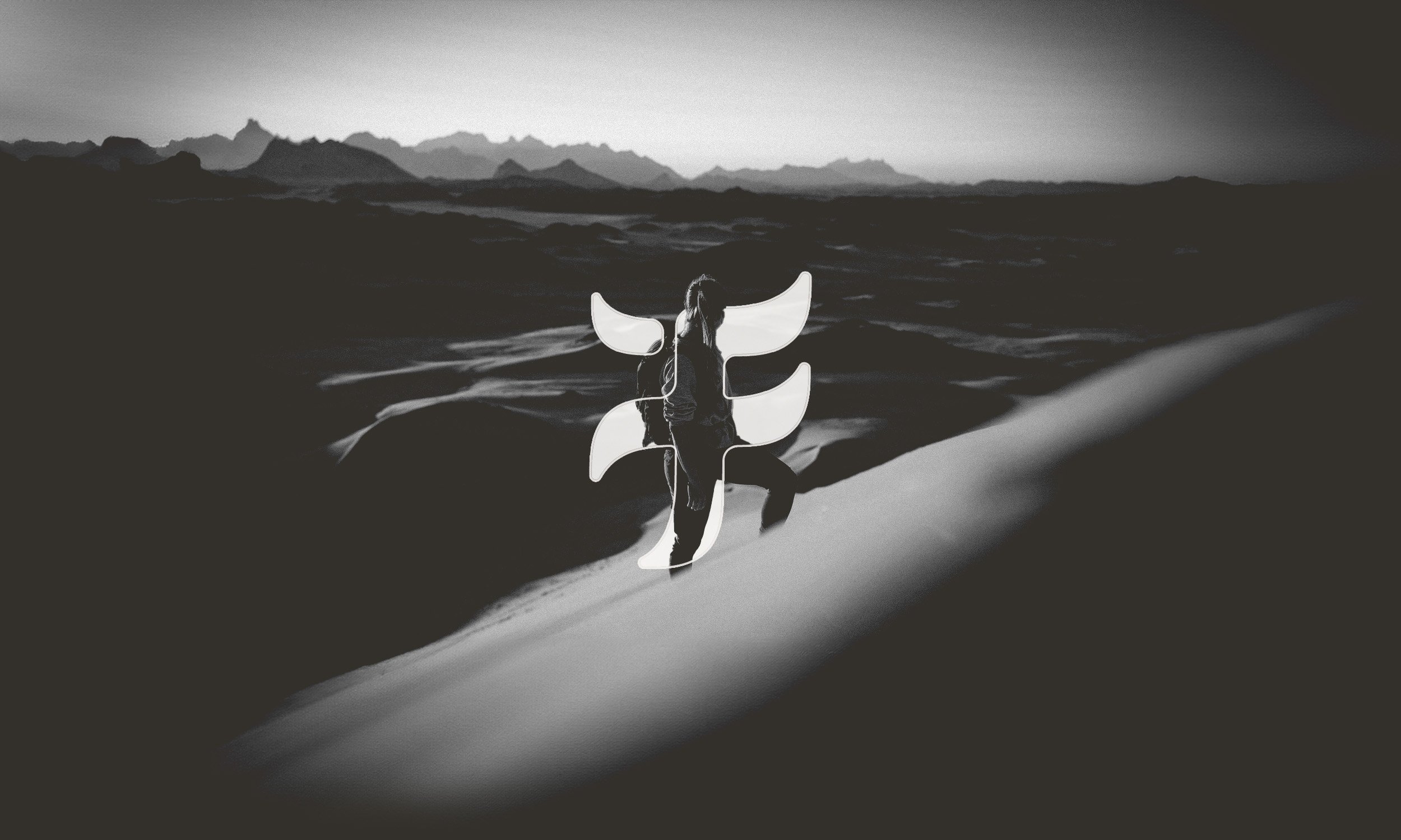
It’s an understanding that this brand is a journey; there’ an entrance and an exit. Notice the intersection with four paths. Where does your journey begin? Where does it end? Which path will you go down?
-
The logo and branding communicates the overall mission and message of the company.
-
Through a somewhat symmetrical shape, there’s an understanding of stability and structure within the brand.
-
The separate ascender off the upper-left side of the “F” represents the individual and how they strengthen the community. Without the individual, there can be no community, and without the ascender, only a void remains.


